
Canopy UI Kit
Improving Collaboration and Consistency Between UX and Frontend Teams
Client:
Canopy Tax
Year:
2023 - 2024
Disciplines:
SaaS Design, Design Systems, Information Architecture, UX/UI, Cross-functional Collaboration, Leadership
The Challenge
The collaboration between the Frontend developers and the UX team was limited to individual squad work, resulting in significant challenges:
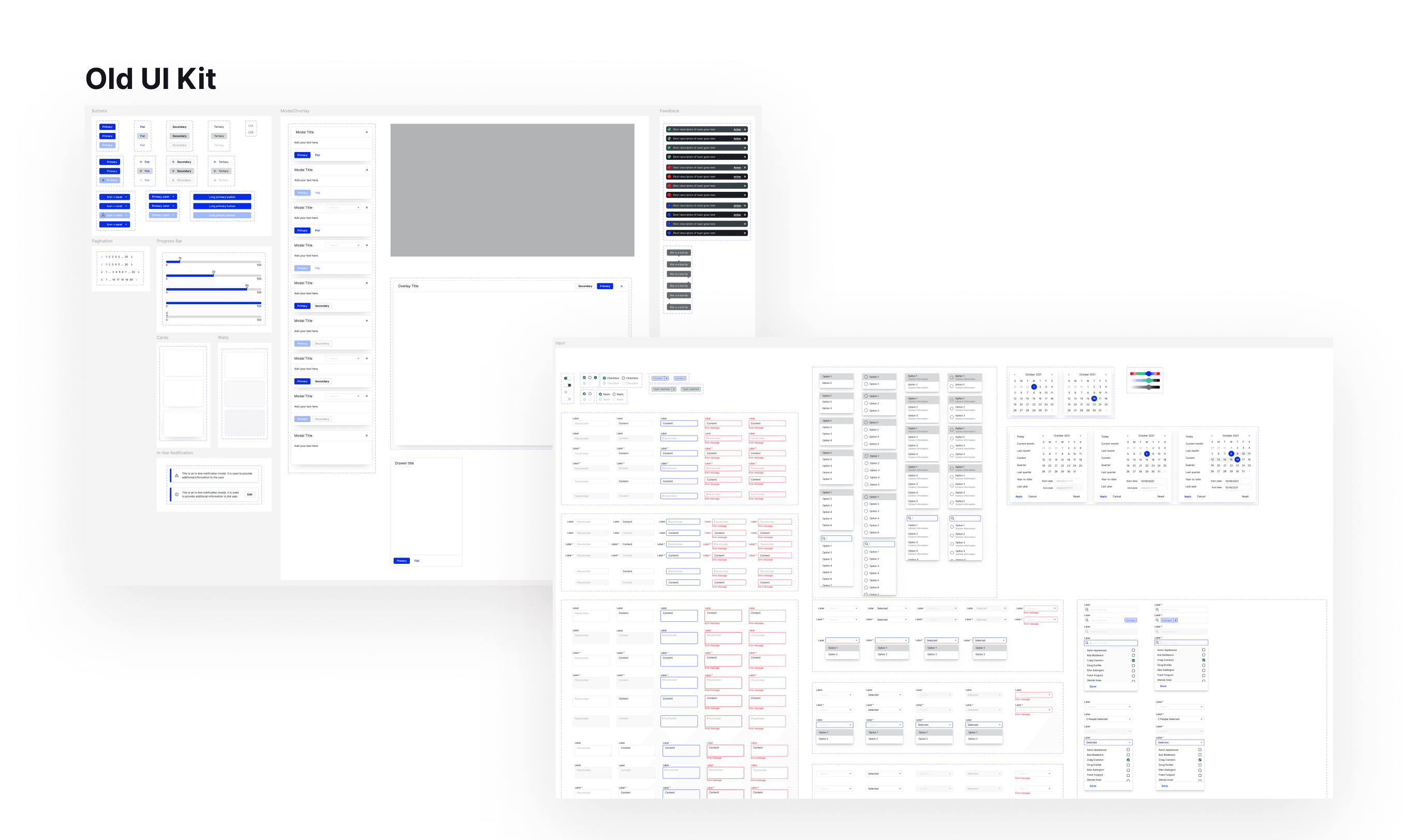
Inconsistent Documentation and Development
Isolated Components and Fragmented UI
Unmaintained Figma Style Guide
The Solution
As the Director of UX, I oversaw this project and ensured the successful execution of these strategies. I assigned tasks to the designers on my team and myself based on our workload capacity, ensuring an even distribution of responsibilities and steady progress. The solutions we implemented included:
Cross-Team Meetings: Weekly meetings were introduced to bring the UX and Frontend teams together, encouraging open dialogue and shared understanding of design principles.
Centralized Documentation System: A unified documentation platform was created to serve as the go-to resource for all design and development guidelines.
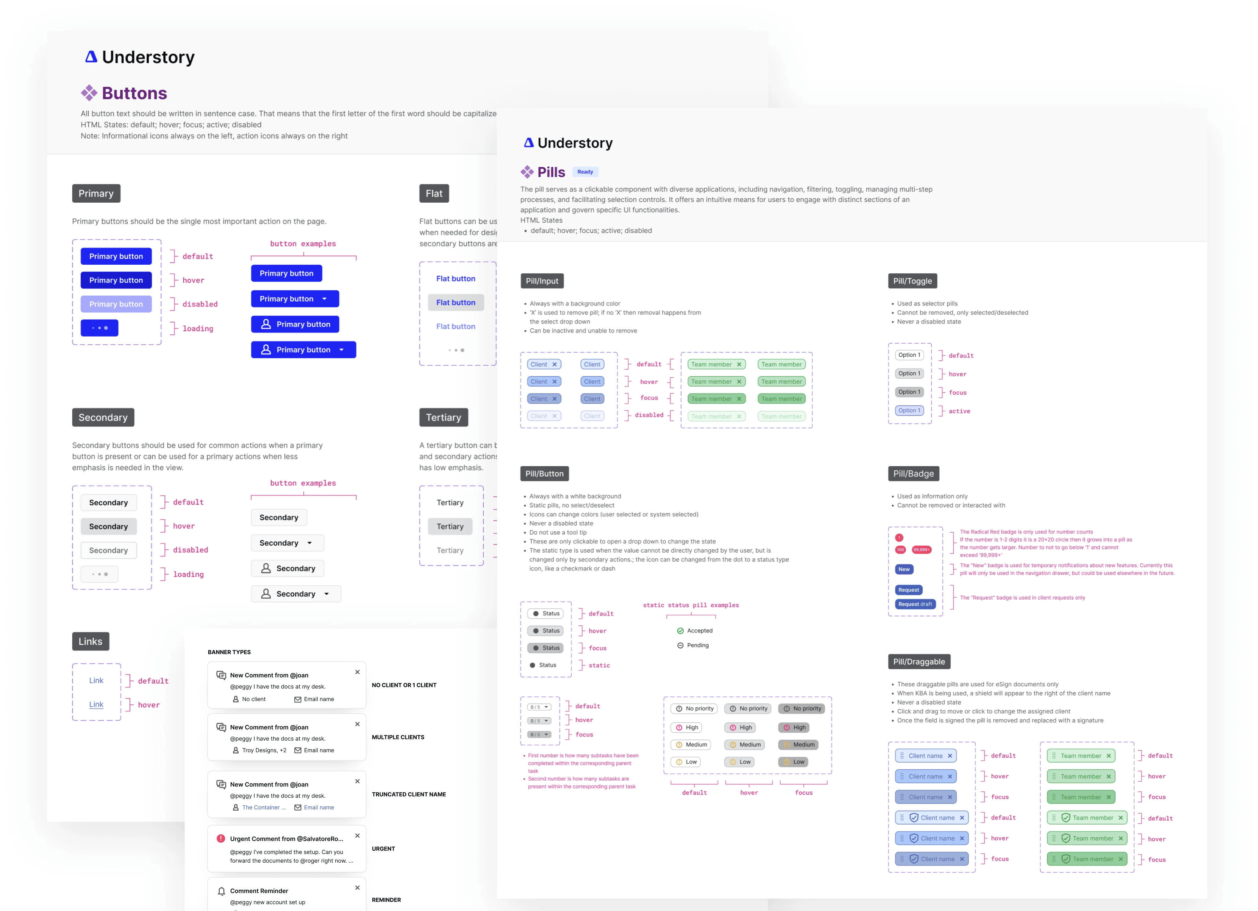
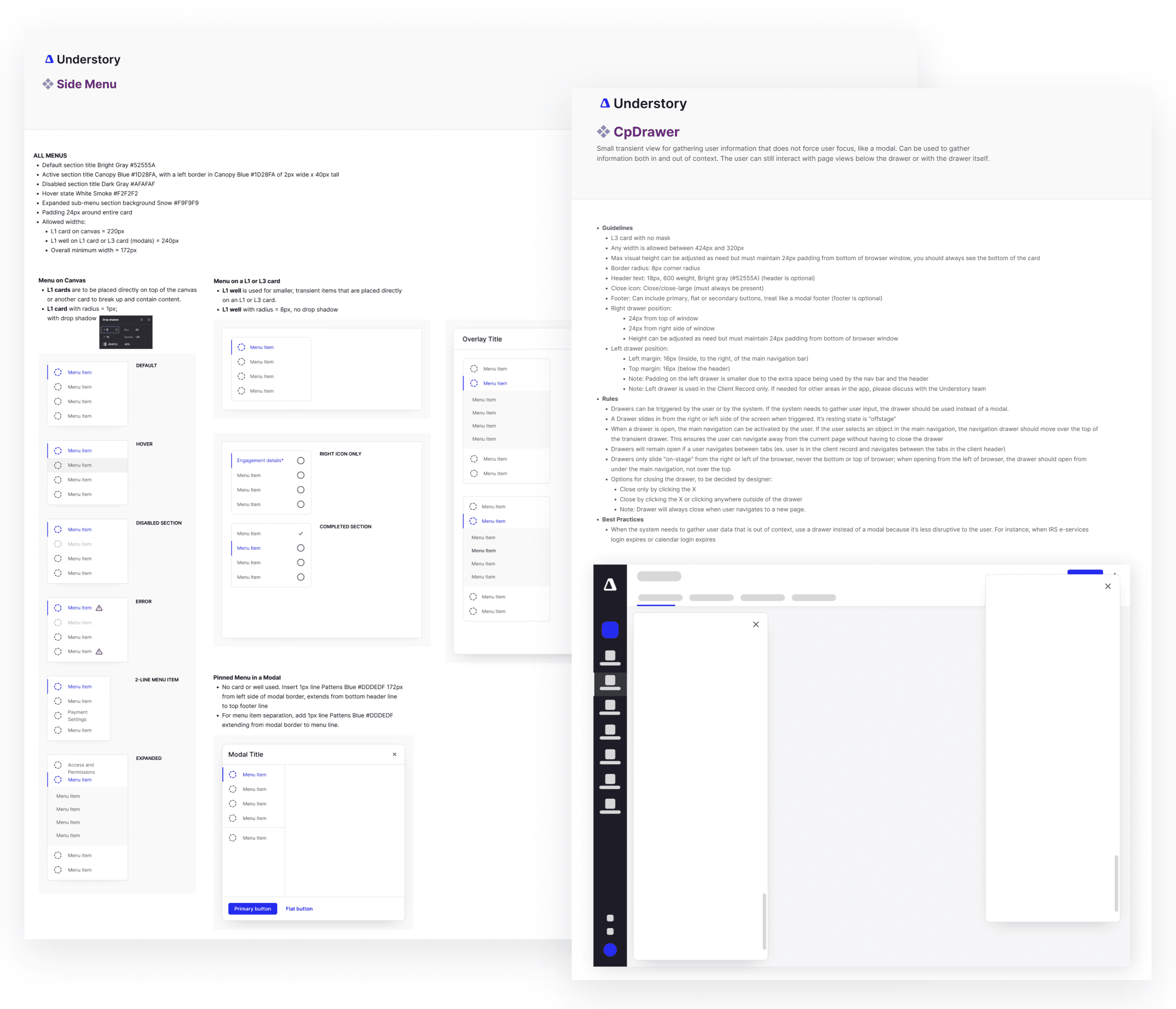
Style Guide Overhaul: The Figma style guide was redesigned and rigorously maintained, with clear ownership assigned to ensure ongoing updates and adherence.
Storybook Integration: We created a dedicated JIRA board to facilitate collaboration between the Frontend and UX teams. With the support of a project manager, every new or updated component from Figma was documented as a JIRA card and assigned to a developer for implementation. This process ensured seamless alignment between Storybook and Figma, fostering consistency across our design and development systems.
To address these issues, it became clear that:
Improved and More Frequent Communication between the UX and Frontend teams was essential to align on design and implementation goals.
Better Collaboration Practices were required to break down silos and foster teamwork across squads.
Enhanced Style Guide Organization and Maintenance would provide a single source of truth, ensuring consistency in design and development.
The Results
Improved Consistency: The UI became more cohesive, with fewer discrepancies between design and development.
Enhanced Collaboration: Teams reported stronger alignment and a better understanding of each other’s workflows.
Streamlined Processes: The updated style guide and centralized documentation reduced redundancy and rework, saving time and effort.
By fostering better communication and collaboration, and investing in the maintenance of shared resources, we successfully addressed the challenges of fragmented design and development. This process not only improved the quality of our product but also strengthened the partnership between UX and Frontend teams, setting a strong foundation for future projects.